Meal List
An easy way to keep you in control of your healthy lifestyle. Meal planner + shopping list blissfully combined.

Project Length (Conceptual)
12 hours
Primary Design Tool
Figma
My Role
Designer/Creator
Problem
One of the most difficult parts of eating healthy foods is planning out meals that are nourishing. The added challenge of remembering what each piece of produce was for lends itself to forgotten vegetables and fruits pushed to the back of the fridge and money wasted.
Solution
Choose from user-uploaded recipes to plan out a week of meals, utilize a generated shopping list, and use all your beautiful produce before it goes bad in the fridge. Having a plan for plant-foods increases the liklihood you’ll use them before they expire.
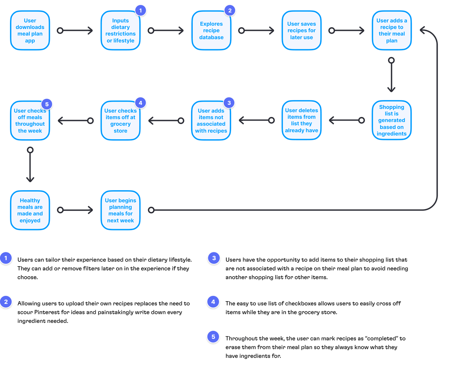
Project Flow
Starting out a project with a clear road map forces me to thoroughly think through the project before jumping into design. It also assists in desiging in chronological order and avoids blind spots from jumping too much throughout the project.
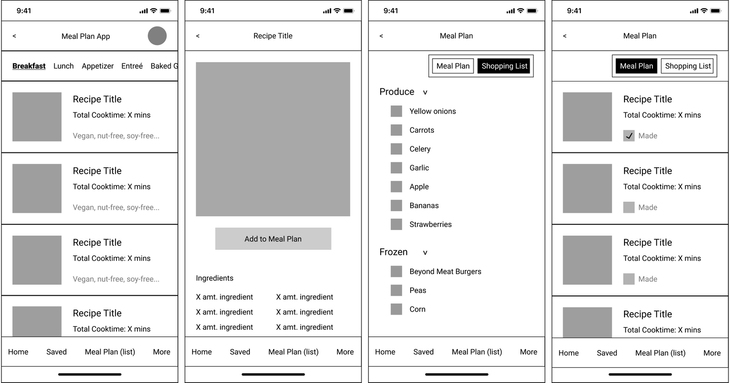
Low Fidelity Designs
I find that starting with low-fidelity makes the transtion to high-fidelity design incredibly smooth. I usually make some rough mockups in Figma, but occassionally I will sketch out a layout or iterations of a specific element. The initial layout and structure of the project was nearly unchanged between low and high fidelity renderings.
Navigation
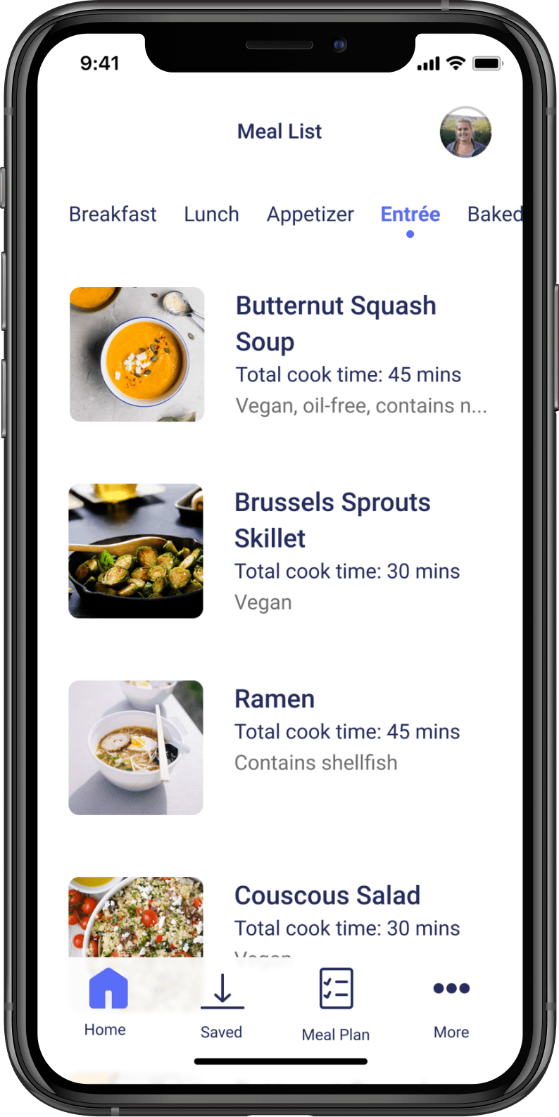
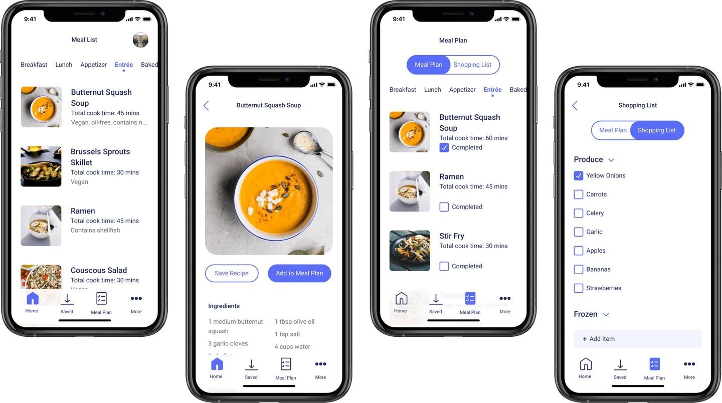
Screen: Home/Discover
In the home tab, users are able to scroll through recipes and use it as a “discovery” section. The bottom tab bar takes user from home, to saved recipes, to meal plan, to more options.
Above the list of recipes is a horizontal sliding navigation bar to allow users to easily choose which type of meal they may want to make. The selected “meal type” is bold, blue, and underscored by a small circle to show which catergory a user is currently in.
They also have easy access to their own profile via the avatar at the top right of their screen.
Primary Actions
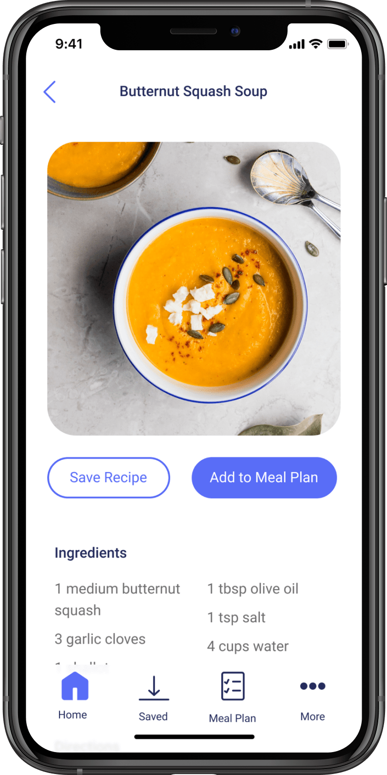
Screen: Recipe Detail
Users are carefully guided throughout the app. Each screen has one clear primary action and may also have secondary or tirtiary actions to accompany it. Interactive elements and primary actions are indicated by a blue background or a blue stroke for buttons.
In this case, users are encouraged to add a meal to their meal plan, thus creating a shopping list for them, but they can also choose to simpy save the recipe if they are not ready to make it but want the recipe in their arsenal.
All ingredients are listed right at the top for convenience and detailed directions are listed directly below. When looking for recipes online, users typically have to scroll through a long blog post of someone rambling on about their life story when people really just want to understand how to make the meal.
Interaction
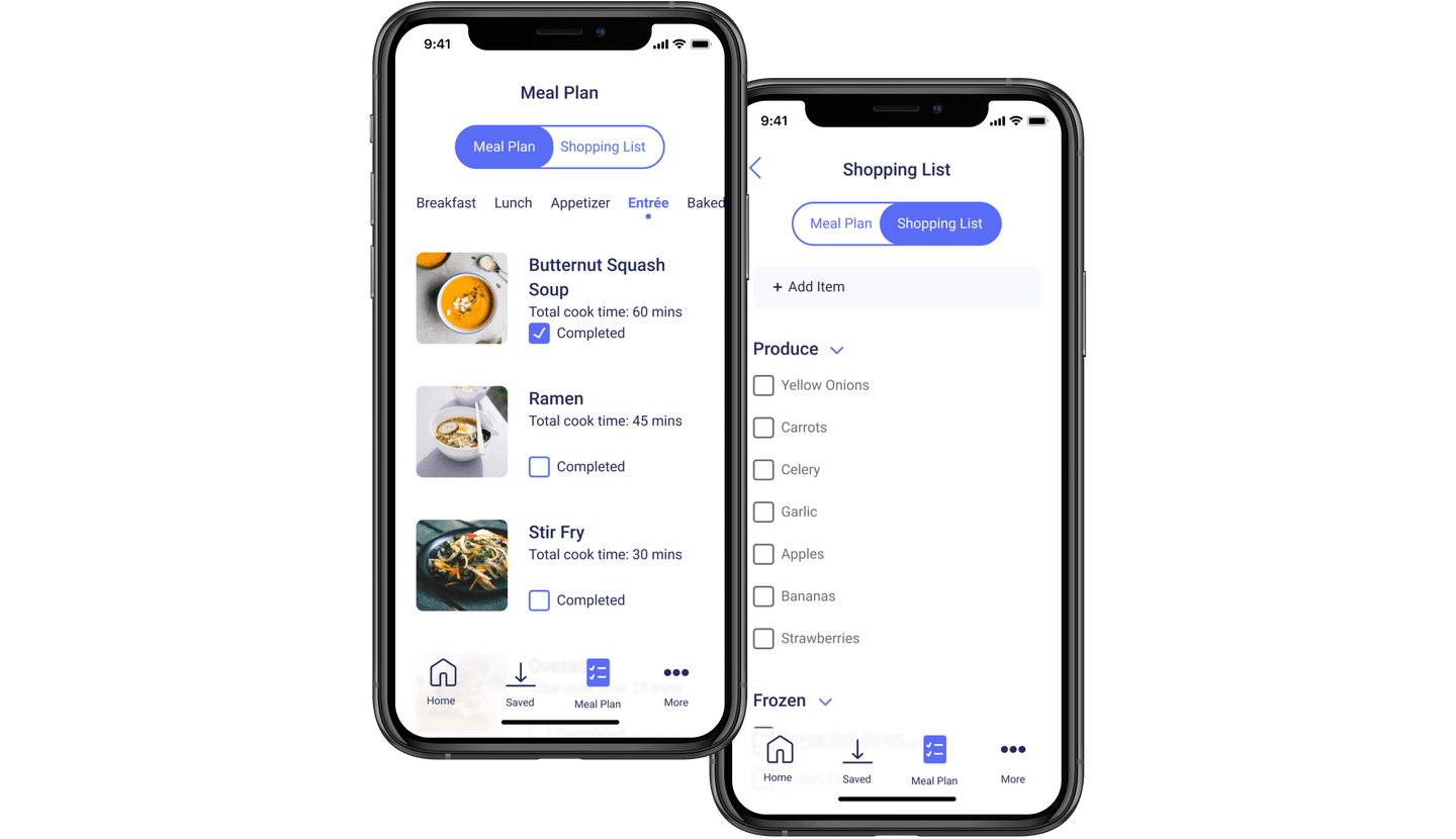
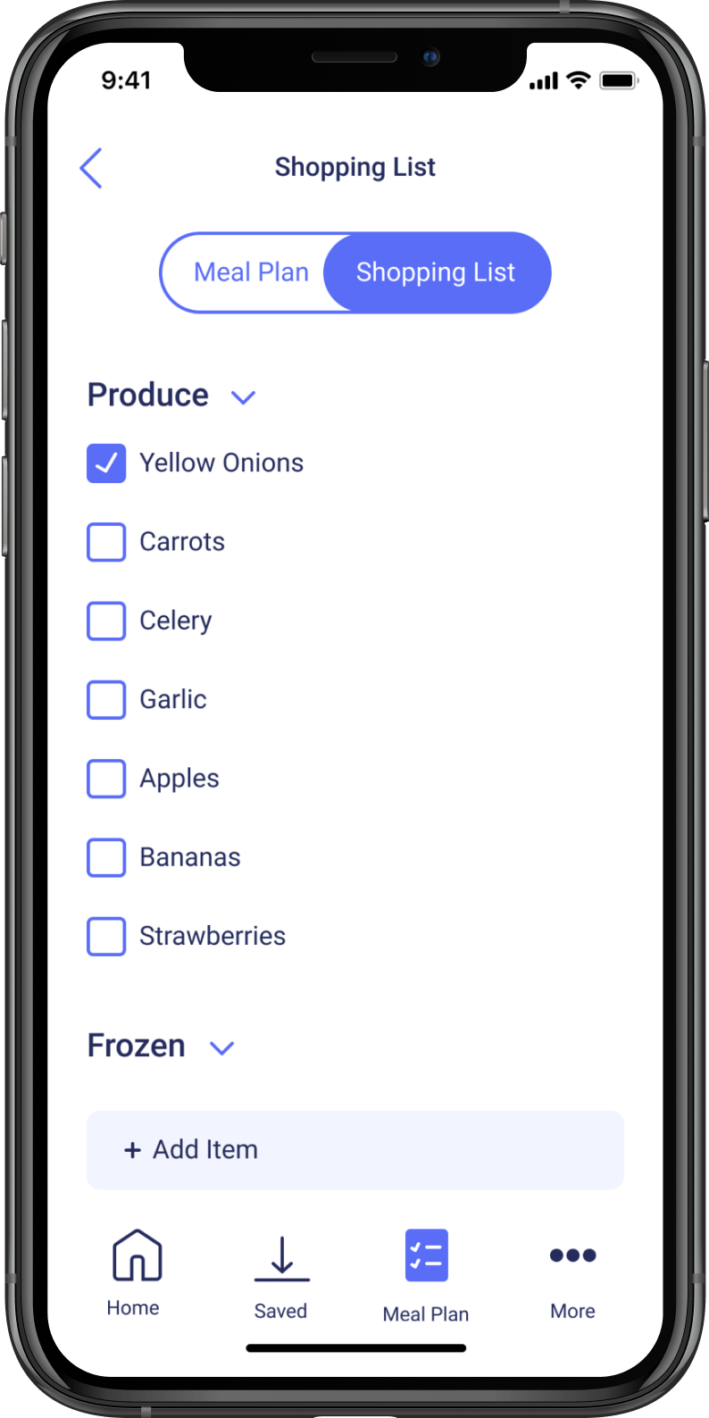
Screen: Shopping List
A shopping list is automatically generating based on recipes users have saved to their meal plan.
Major points of interaction are using the toggle to switch back and forth between their meal plan and generataed shopping list, checking items off the shopping list, minimzing and maximizing grocery categories, and adding item to the list that don’t apply to recipes saved in the app. The “Add Item” button is a cool gray so as not to compete with the toggle at the top of the screen.
Interactive elements are clear and easy for the user to understand because they follow an expected pattern of blue hues to indicate what they can manipulate.
Color Palette
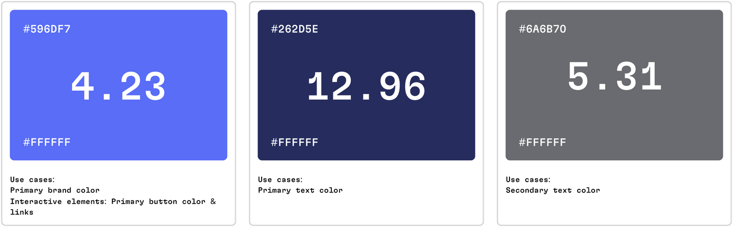
My goal for the primary brand color was to surpass a score of 4.0. The primary brand color is used in various interactive elements, most notably buttons. The boldness of the primary button really showcases the delicate balance of periwinkle and blue in a bold way.
Instead of using plain black text, I opted for using a dark blue to compliment the periwinkle found scattered throughout the interactive elements of the app. The dark blue helps tie all the different elements on the screen together.
Strengths & Challenges
Strengths
- Visually stunning and overall clean feel
- Intuitive flow patterns and clear indications of interactive elements
- Potential to be a genuinely helpful tool for users
Challenges
- Main brand color is just shy of passing AA standard
- User-uploaded content could be misused and irrelevant to the mission of the app
- Tab bar icons could be designed in a clearer way to avoid needing icon labels