Mobile Order
Mobile ordering coffee should be easy, intutive, and save you time.

Project Length (Conceptual)
4 hours
Primary Design Tool
Figma
My Role
Designer/Creator
Problem
For users who like to mobile order their coffee every morning, time is of the essence. There were several pain points when using a local coffee shop’s mobile order app that made the experience more tedious and less enjoyable.
Solution
A simple redesign of the app to enhance user-friendliness, good design practices, and get through the order process more efficiently.
Audit
To get started, I conducted an audit of the existing UI to get a better understanding of the overall function and flow of the app.
My initial observations focused on areas of the design that would need to be changed. The impression this app leaves users with is feelings of clumsiness, unattractiveness, and an overall feeling of clutter.
Specific elements make the app less enjoyable to use and visually unappealing including:
- Close margins to the edge of the screen
- Unclear primary and secondary actions
- Lists and other data tightly packed together making it difficult to quickly scan
- Color choice - cool grays mixed with warm orange tones
- Navigation has more detail than necessary and can be confusing
Another pain point for the user is the flow of actually ordering the drink. Since there are so many options to choose from in how one can customize their drink, it would be important to “chunk” the process to ease the process for users to scan and select their drink options.
As it currently stands, Stone Creek’s app has every drink modification in one long list that users scroll through which is not as efficient for users who are looking for a specific modification or don’t want any modifications to their drink.
Simplification
Giving the user a singular option within a flow elimnates the need to parse through multiple actions and suspend decision-making until it’s necessary.
I also chose to remove the bottom navigation since the user would easily be able to edit their location later on in the flow.
Visual
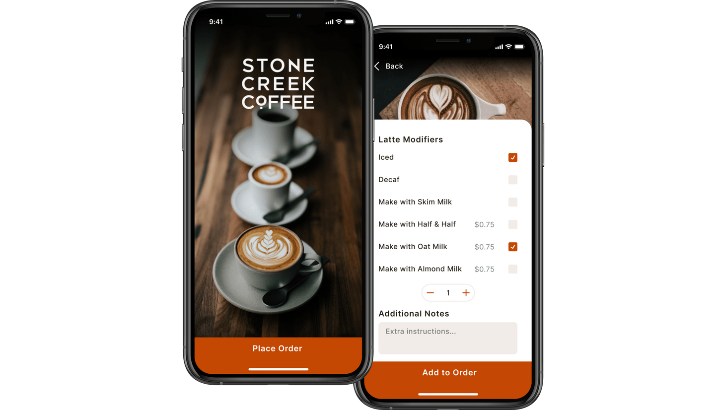
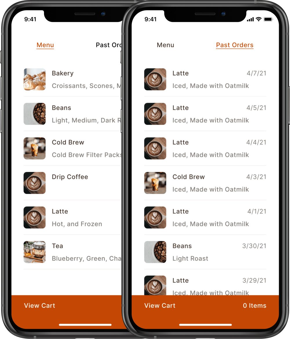
Wanting to make the entire experience more visually appealing, I decided to include thumbnail images for each product users could pruchase and round the corners to give a friendly feeling.
Another goal was to reduce the cluttered feeling the previous experience had so I gave some breathing room between each list item. The new flow also directs users to drill into a category rather than selecting from a large list with everything laid out in the open.
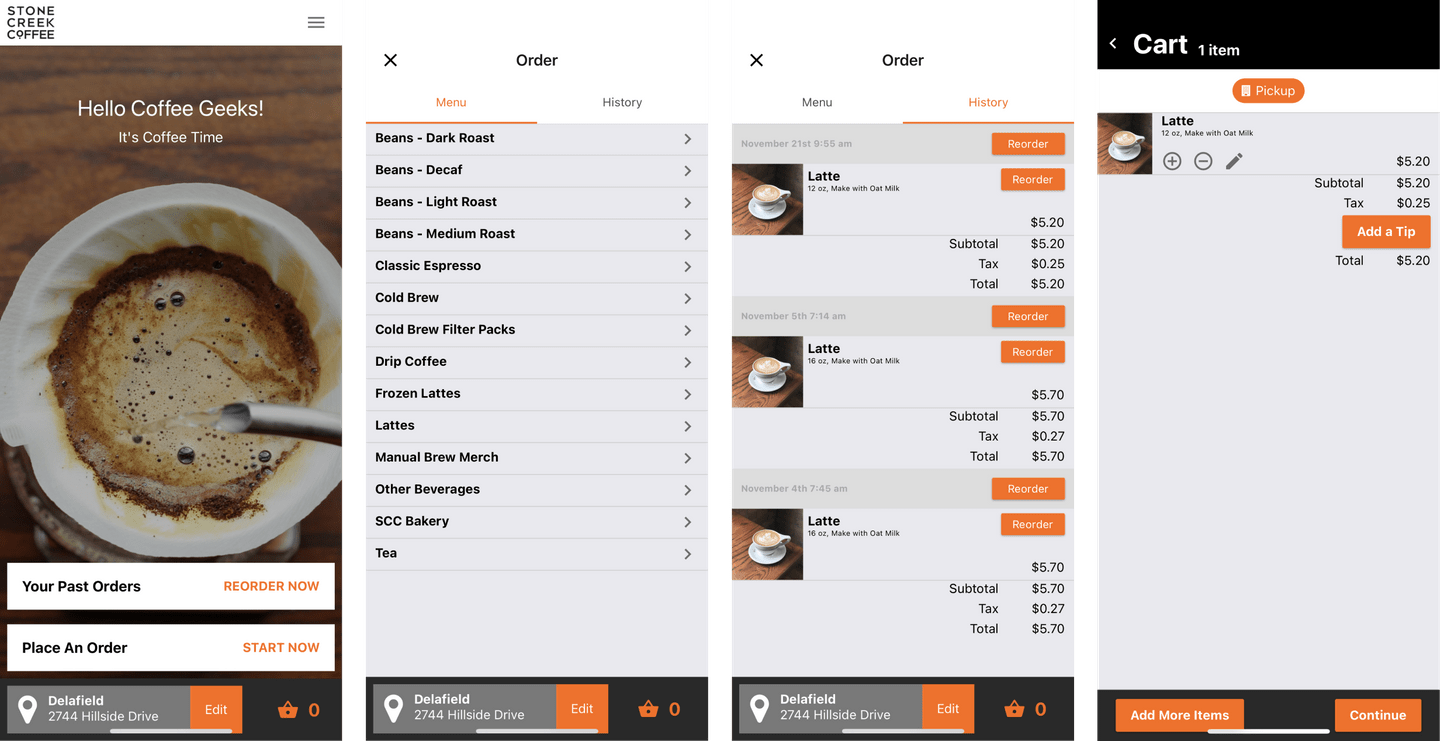
Users are able to toggle back and forth between the menu and their past orders to shorten the amount of time spent searching for a specific item.
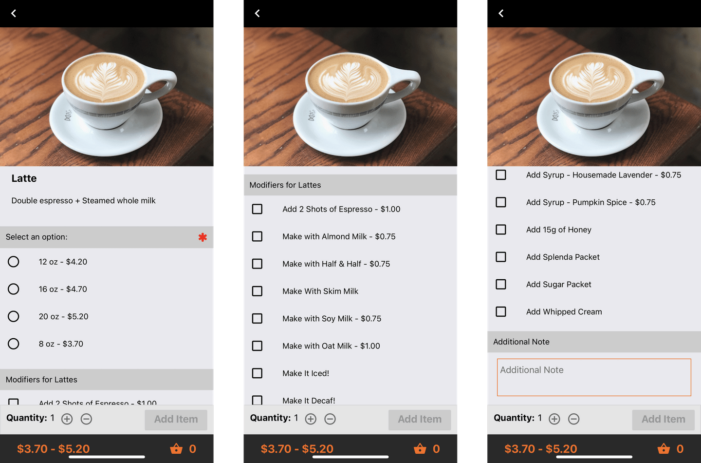
Chunking
The psychological principle of chunking – where the brain divides large amounts of data into smaller units in order to retain them more easily for short term memory – was the basis for my decision to split the drink modification flow into multiple screens.
One pain point that I identified with the former design was the amount of information that was displayed at a time. The previous UI had a long list of modifiction and add-ons which I found to be overwhelming and difficult to quickly scan.
To solve this problem, I divided the information into two separate screens so users could make one decision at a time: size, then add-ons. I also found the amount of choices for add-ons to be overwhelming and decided to reduce the number of choices so users could quickly make decisions and get on with their day.
Hierarchy
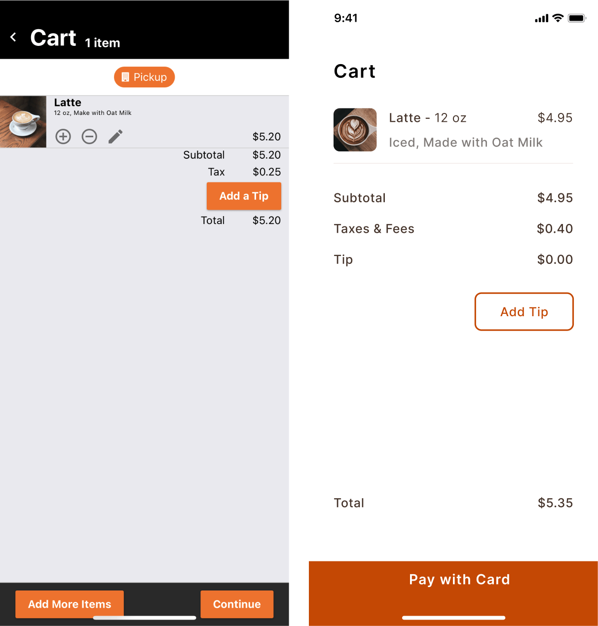
Having a clear hierarchy keeps designs organized and contributes to an overall seamless flow. Knowing what task a user is trying to accomplish on any given screen When the user reaches this screen they are trying to accomplish a specific task: reviewing their order and beginning the checkout flow.
One of the shortcomings of the original design is the lack of clear hierarchy and several different type sizes. It gives users a feeling of clumsiness.
My updated version put an emphasis on clear hierarchy by having a large bold title at the top so users know they are in their cart. I then listed the item in their cart all using one type size and instead used color to differentiate between the list item name, and modifications the user made on a previous screen.
Color Palette
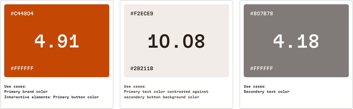
When choosing the new brand color, accessibility was a key factor in that decision. The original orange did not reach AA contrast standard. Choosi ng an orange that surpassed a 4.5 contrast ratio score was difficult, but the hue I ended up with serves a larger community and would still be recognizable to long-time users as the “Stone Creek Coffee Orange.”
I decided to play into the warmth of the primary interactive elements and use a slightly orange-y hue for the primary text as well to help each and every screen feel cohesive.
Strengths & Challenges
Strengths
- New design improves overall flow and reduces amount of clutter per screen
- Accessible color palette, most notably the brand orange
- Increased user confidence with clear hierarchy and organization throughout
Challenges
- Used same type as in original app whereas I could have invested time into choosing a different font
- Secondary text color is just shy of passing AA color ratio
- Less choices for the user in terms of drink modifications than in the original design.