Wishli
A memorable, sharable, delightful wishlist experience. Take out the guesswork and let your loved ones know what you truly want.
Project Length (Conceptual)
20 hours
Primary Design Tool
Figma
My Role
Designer/Creator
Problem
Every birthday or holiday season, family members love to ask for a wishlist. Some gift ideas live in an Amazon wish list, while others might be stored on a Google doc with links. It is inconvenient to send multiple wish lists to family and friends who ask for them.
Solution
One home for gift ideas, an easy way to share them, and a delightful experience of purchasing gifts for others.
Initial Conception
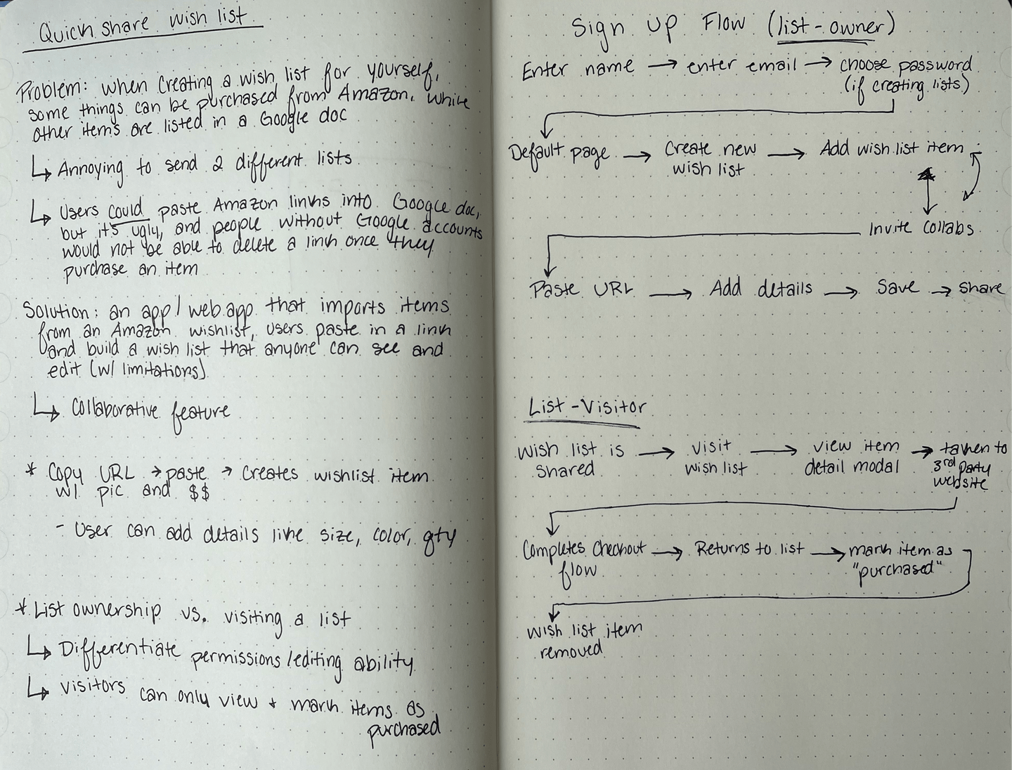
To get started, I created some notes to quickly capture the main idea of the app. I listed out the problem, why it was a problem, and the solution.
In my original thought process I wanted to eliminate the need for a user to create an account since that can be a deterrent for some users to commit to trying a new product. However, as the project rolled out it became necessary for users who create wish lists (list-owners) to create an account in order to differentiate between list-owners and list-visitors. However, list-visitors have the ability to interact with a wish list without needing an account.
I also loosely outlined a possible flow for how the app would function. Below is a more robust look at how a user can interact with the app.
Project Functionality & Flow
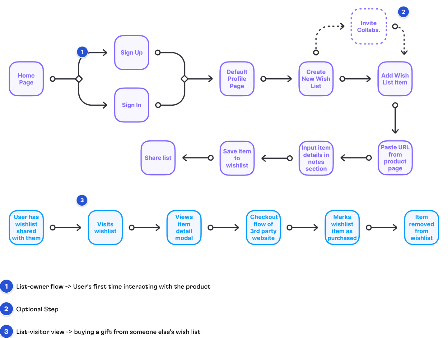
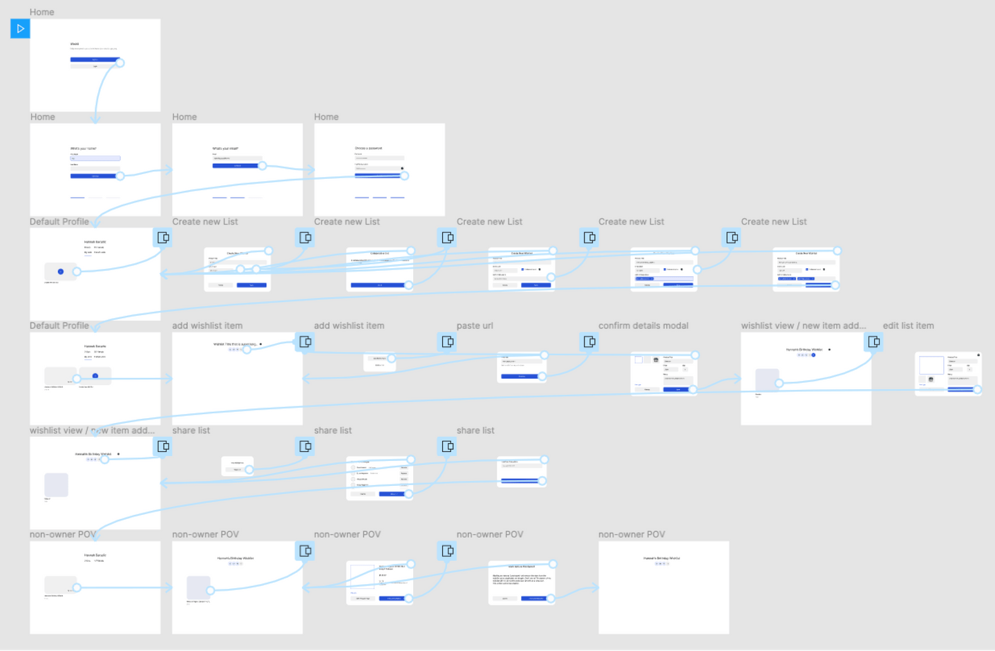
To get a better understanding of how the app would function and how users would interact with it, I put together a flowchart to define those requirements up front.
It was important to think about how users with an account would use the app, (creating and sharing wishlists), and how users without an account (list-visitors) would interact differently. I created a separate flow for each use case.
Users were given the option to invite another user to collaborate with them on a wish list. This use case could be used for wedding registries, baby showers, or larger gatherings where gift giving is involved.
The flow for list-visitors is different from list-owners because they do not have permission to edit items on a wishlist. They are able to view wish list items, purchase through a 3rd party website, and mark an item as purchased to avoid duplicate gifts.
Low-Fidelity Designs
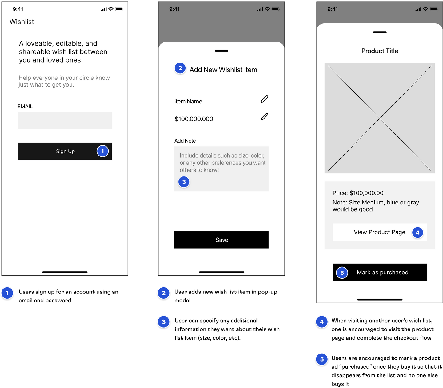
After establishing the flow, my next step was to put together some low-fidelity screens. This step was a valuable in the design process because it allowed for quick iterations and kept my focus on layout and user experience rather than stepping into type and color before I had a solid blue-print.
Across various iterations I was able to see how placement and expression of certain elements would lend itself to better usability. For example, deciding between a large button across the bottom-center of a screen, or a small button at the top right of the screen. Best practices show that users prefer to tap buttons with their thumb, and their reach is best near the bottom of the screen.
User States
Progressing into high-fidelity designs was made much easier by the legwork done with the low-fidelity screens. This project highly utilized Figma’s variants feature when it came to fleshing out different user states on a component level. Below are just a few examples.
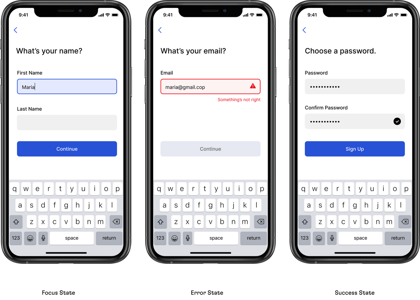
Focus State: When a form field is in a focus state, the background is filled in with a light blue and a blue stroke is applied. The user can also tell that they are inputting date into a form field because a keyboard pops up and a cursor appears.
Error State: When an error state in a form field is necessary, the background becomes a light red with a red stroke around the border. An icon appears to the right of the field with an exclamation point and an error message under the field reads “Something’s not right”. The “continue button” remains disabled until the error is fixed.
Success State: Used when the users passwords match, a balck checkbox icon appears on the right edge of the form field and the main CTA “Sign Up” button transforms from an inactive state to a default state.
Accessibility
Creating experiences with accessibility at the forefront of design decisions is one of the best ways a designer can empathize with their users. From error states, type size, to primary and secondary colors, accessibility played a key role in my decision making process.
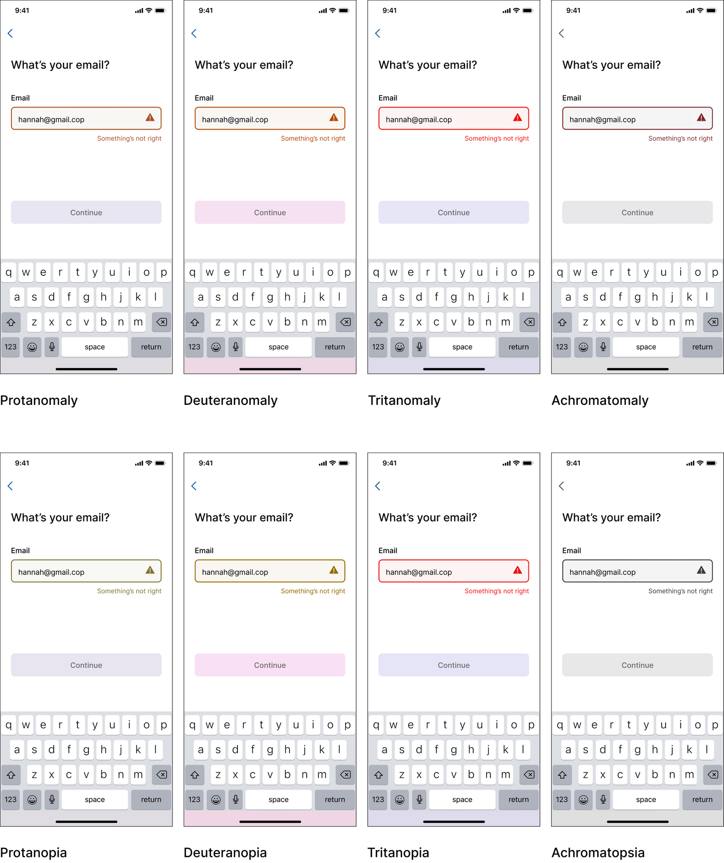
When it came to designing an error state it was clear that there were additional measures to be taken rather than solely relying on the color red. Below are a few variations of what users with different types of color vision would see when experiencing an error state.
For users with typical color vision, the red background and red stroke would be a sufficient indication that an error has occurred. For individuals with varying types of color vision or color blindness, that message could get lost without additional indicators.
Using a Figma plugin called “Color Blind,” I was able to actually see what users who had various types of color vision would see and it helped my decision making with how to make the error state more obvious without solely rely on color to communicate that message.
I added two clarifying measures: an error icon on the right side of the form field with an exclamation mark - a clear indicator that something is happening – and a short error message beneath the form field. Users who had no color vision would understand that an error needed to be fixed before progressing further through the signup flow.
My goal was to choose color values that had contrast ratio scores of 4.5 and above. I was happy with the primary color reaching 6.43 because in order to reach a AAA score of 7.0 would have drastically changed the look and feel of the blue. I made sure all of the supporting hues were of high contrast, well surpassing the AAA score.
Modality
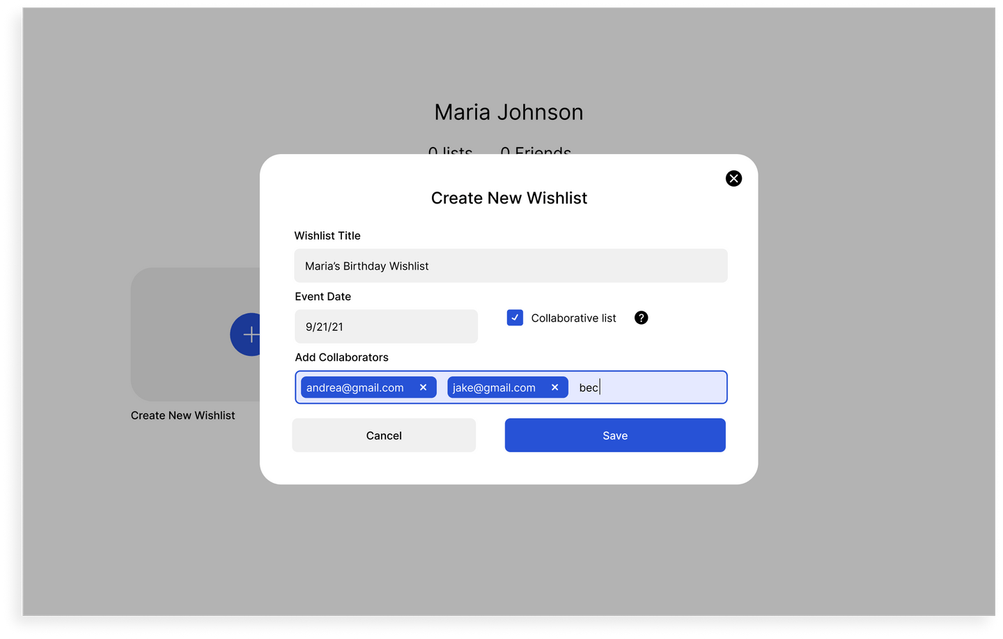
When a user wants to create a new wish list, a modal appears for them to complete the task. I felt that a modal approach would be a better approach for completing a task rather than redirecting the user to a new page.
I chose to go the modality route because it gives the user context to where they just were, since they can still see parts of the previous screen behind the modal, but also interrupts an expected flow to capture their attention and encourage them to complete the task. Keeping the context of the action in view would help prevent confusion and frustration as to what the user is trying to accomplish.
In addition to preserving context, the modal utilizes labels above the form fields so they will always be in view. This design decision reduces the chance for the user to forget what type of information they were about to input.
Visual
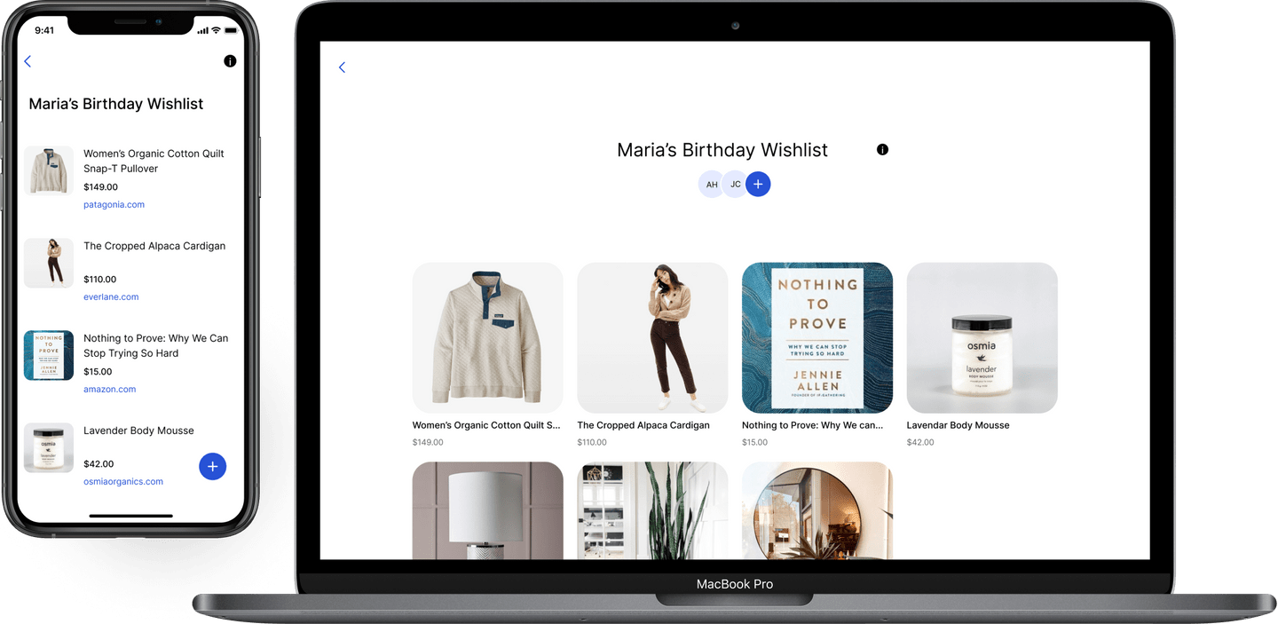
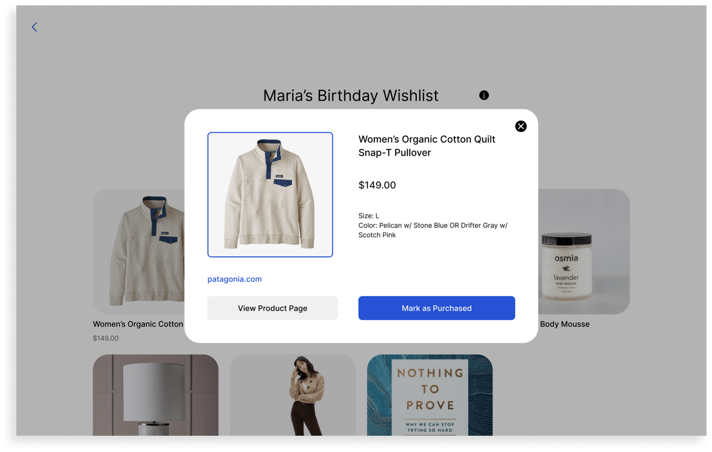
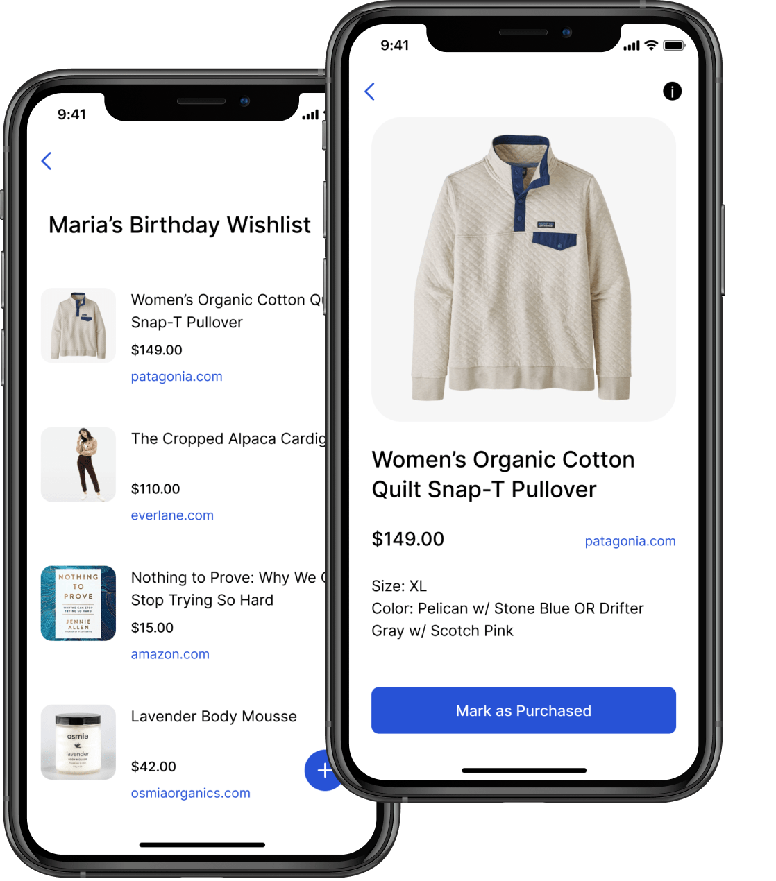
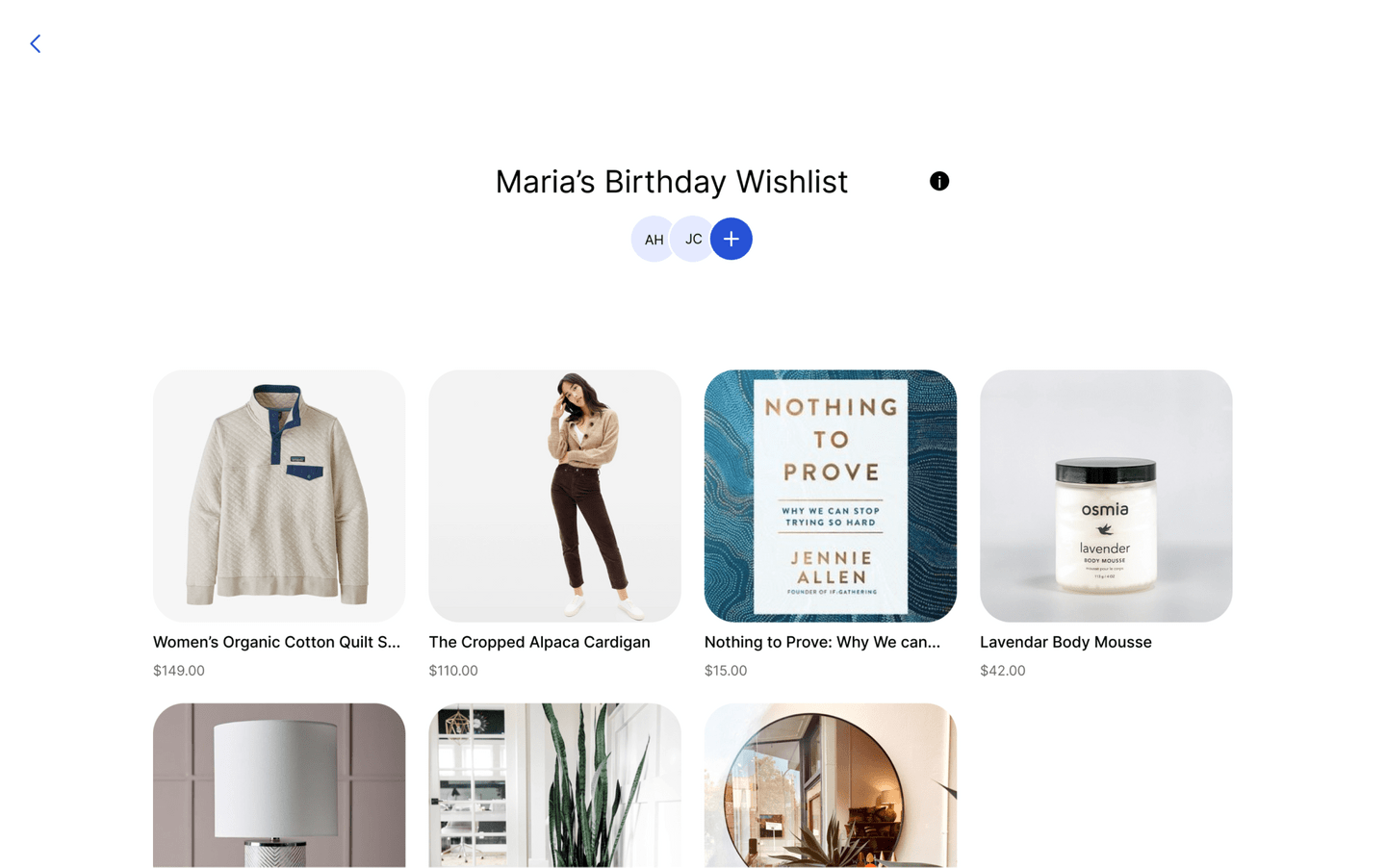
Inspired by Pinterest, I wanted to make the wishlist experience extremely visually appealing by utilizing lots of imagery and rounded corners to give a friendly feeling.
By pasting the url to the wishlist item and scraping the image from a 3rd party site, the user is saved the hassle of uploading an image. Having images for each item on the list is much more engaging than simply using text.
I also recognize the importance for gift-buyers to see the the price of each item right up front and made it highly visible to allow users to quickly scan a wish list and choose a gift within their price range. This prevents frustration from users having to individual click on each item and dig for a price.
Prototyping
Working through the flow with high fidelity screens with Figma’s prototype feature was an excellent way to discover where users might reach a dead end, and how I could redirect them back to adding more content.
This exercise also allowed me to see the project start to come to life. It also was a blind-spot check and showed me areas that I had previously overlooked.
Strengths & Challenges
Strengths
- Accessible color palette
- Logical flow pattern to provide users with a seamless experience
- Design feels clean and easy to use
Challenges
- Scraping images and data from url’s is not as reliable as anticipated
- Users would have to know the email address of whoever they want to share their list with
- List-visitors have to remember to return to the wish list and mark an item as “purchased”
